Is Responsive Overhyped?
Responsive Web Design is all the rage. All of a sudden, we hear advocates asserting that “responsive is the way to develop sites.” Or “Google recommends responsive for SEO.”
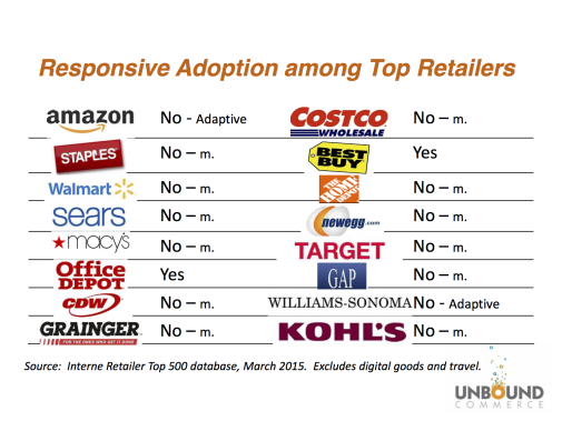
Observers might think that this approach has become the de facto standard among e-commerce leaders. But a close look at the top companies in the Internet Retailer rankings, reveals a surprising reality:

Among these top 16 retailers, only 2 have gone with responsive, despite obviously having the resources to do so if they wished.
So, what’s the disconnect here? Why hasn’t this hot-trending technique taken hold among the industry leaders? Are we confusing mobile-friendly as mobile-optimized?
Pros & Cons Summary
The table below summarizes the key advantages and disadvantages of responsive and dedicated approaches to mobile.
| Responsive | Dedicated | |
| Advantages |
|
|
| Disadvantages |
|
|
What Is Responsive Web Design?
We can answer this from 3 vantage points:
- Technical: Responsive is the use of a media query in a website’s HTML, giving formatting instructions to the browser, and instructing the browser how to reformat the page to fit the width of the screen.
- Design: a design approach that allows different device types to be served by a single set of HTML pages.
- Strategy: an approach of “one site fits all” for handling different types of devices.

Another way of looking at responsive is how Google positions responsive alongside the 2 other recommended approaches to mobile:
- Responsive web design: Serves the same HTML code on the same URL regardless of the user’s device (desktop, tablet, mobile, non-visual browser), but can render the display differently (i.e., “respond”) based on the screen size. Responsive design is Google’s recommended design pattern.[1]
- Dynamic serving [aka Adaptive]: Uses the same URL regardless of device, but generates a different version of HTML for different device types based on what the server knows about the user’s browser.
- Separate URLs [aka Dedicated]: Serves different code to each device, and on separate URLs. This configuration tries to detect the users’ device, then redirects to the appropriate page using HTTP redirects] along with the Vary HTTP header.
[1] Google goes on to say that they do not favor any particular URL format as long as the page(s) and all page assets are accessible to all Googlebot user agents.
Responsive Strengths
Responsive is an elegant solution for handling small screen sizes. By reprogramming the desktop site’s HTML and redesigning the layout, site owners can deliver pages that know how to adjust for screen size via a media query, that lets the html respond to the browser’s screen width.
Responsive meets the standards Google has set for being mobile-friendly. Due to this, responsive sites, properly done, will be saved from Google’s Mobilegeddon.
And because of the “one-site-fits-all” approach, there are fewer content elements to control and therefore fewer management tasks. Advocates of responsive say this leads to a lower cost of ownership.
Responsive Weaknesses
Responsive has one glaring problem: slow page load speeds. A responsive page works by delivering more content to the smartphone, and then asking the mobile browser to sort things out based on its screen width. This performance gap was reported by Internet Retailer:
It turns out responsive design sites are slow on smartphones, very slow. That’s the conclusion that emerges from an Internet Retailer-exclusive, monthlong study of 12 e-retail responsive design sites conducted by web and mobile performance testing, monitoring and analytics firm Keynote.
A secondary weakness is that deploying responsive is complex and can be disruptive to the main website. As a result, responsive deployments tend to be more expensive than dedicated projects.
Dedicated Strengths
Dedicated is the better choice when a retailer actually wants to have the mobile experience different than the desktop experience. The “one-site-fits-all” advocates might ask why you’d ever want to deliver different experiences. There are several compelling reasons because – as we all know – mobile is so much more than just a small screen:
- Mobile UI Capabilities – Mobile brings enhanced capabilities for interaction – such as location, touch, voice, camera, fingerprint, and motion. All can add richness to the mobile experience. Today’s desktop site does not support these capabilities, nor does it need to.
- Different User Circumstances – Consumers have their phones in many places and settings that the desktop site needn’t worry about: in stores; on sports fields, in the garage, where the retailer’s product is being used; or in social settings. Most retailers can find new advantages here.
- Different Desired Outcomes – Because of its omnipresence, mobile is the ideal omni-channel device. We know consumers use mobile for product discovery & research, even when they complete the purchase in a different channel – online, in-store, or call center. Why wouldn’t the mobile UI help facilitate this in a way that’s different than the desktop? Different calls to action; and different ways to prioritize them.
Dedicated Weaknesses
The conventional wisdom is that a dedicated site is something else to manage and that it represents an additional cost of ownership. Conversely, the counter view is that dedicated is a more cost-effective way to manage your mobile customers.
In addition, it is often asserted that Google will give an advantage to responsive sites. But, as discussed in the What Is Responsive section above, Google states that it does not favor responsive over dedicated.
Perspective
- Responsive is a good choice for adapting a desktop site for the small screen.
As a web development technique, it’s an elegant way to deliver a small screen experience. - Dedicated sites are the better choice if the retailer wants the mobile experience to take full advantage of uniquely mobile capabilities.
For retailers who want to get the most out of mobile, dedicated sites make it easier to build a mobile-specific experience — one that takes advantage of unique mobile capabilities that the desktop site isn’t geared for. And to deliver different calls-to-action that optimize across all channels.
Responsive is a very useful technique for adjusting web pages to screen size. Due to this, developers love it as a tool. Unbound uses it as one of several methods for integrating the mobile experience into the retailer’s web infrastructure.
But that doesn’t make it a good mobile strategy.
If mobile-friendly is good enough for your company, then responsive is a fine choice. Comparatively, a better choice for your company might be to take full advantage of mobile-unique capabilities and deliver a distinct mobile experience. Unbound loves working with retailers who want to make the most out of mobile.
Keith Lietzke is the Co-Founder of Unbound Commerce. You can reach him at [email protected].