RWD vs Dedicated Mobile Site

The Great Debate: Responsive Design VS Dedicated Mobile Commerce

The Great Debate: Responsive Web Design (RWD) vs Dedicated Mobile Commerce.

Responsive Web Design (RWD) is a hot topic. On one hand, the appeal of “one site fits all” is understandable. But retailers should take a careful, deeper look before jumping on this bandwagon.

We speak with retailers every day and the two most common claims we hear in favor of responsive are:

1) Google recommends it, and

2) One, single site displayed on all devices will be easier to manage.

In this post, we’ll address these two points head-on.

1) The Google SEO Recommendation Fallacy

Advocates and solution providers that sell RWD happily spread the claim that Google recommends it. It’s true that Google once stated that it recommends responsive, but they’ve never connected this to a negative implication regarding SEO rankings and they certainly have never called out the profound differences between content sites and commerce sites. Google makes its billions off advertising and it’s easy to see how responsive makes THEIR job easier. But, obviously, the real question is what is right for you, as a merchant.

Plus, Google almost immediately backtracked from this recommendation. Maile Ohye, SEO lead at Google, clarified that Google is neutral among the 3 different approaches: responsive, dynamic content, or a dedicated mobile site. What he said, regarding best practices from the perspective of Google crawlers & algorithms, was, “All three options work well for users and for Google, so use the best implementation based on your infrastructure, content, and audience”.

Again, retail sites and content sites are NOT the same. You can read more about this in The Definitive Guide To Technical Mobile SEO from SearchEngineLand, a major authority in this space. The key to understanding here is the use of alternate/canonical tags on the desktop & mobile sites respectively, as recommended by Google.

Of course, Unbound follows this best practice, while delivering a custom mobile experience built from “whole cloth” specifically structured for maximum mobile conversion rates, delivered to a (growing) mobile audience.

In fact, there are times when RWD actually hurts SEO rankings, as noted in this article, titled “When Responsive Web Design Is Bad For SEO”.

“The one URL argument for dynamic serving and responsive design’s superiority is moot with the introduction of switchboard tags, as Google can now understand which site should appear when regardless of URL structure.”

2) The One-Site-Fits-All Fallacy

The promise of RWD is that a single set of HTML codes can serve all device sizes. This is possible because the site is able to adjust itself for that screen size.

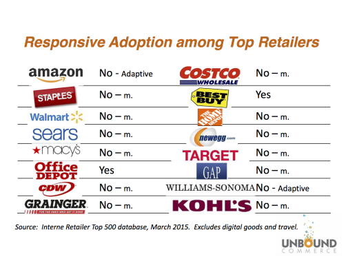
While it’s a neat trick and an easy, quick sell, we assert that this approach is actually a significant disadvantage, especially for retailers. And top e-commerce retailers seem to agree. Amazon, Walmart, Staples, Zappos, (and Google). All of them could employ any approach they want and have decided that responsive is not for them. Why not? Here are some key reasons:

  • RWD sites are slow.

    All the code (for mobile & desktop) is delivered to the browser. The browser has the responsibility to sort it all out based on what kind of device is using it. This takes time and every second a page loads kills conversion rates.

  • Mobile is so much more than just a difference in screen size.

    Mobile is personal, and it is always on. Mobile commerce is conducted in different ways for different reasons, at different times. Mobile consumers behave differently, so why offer them the same experience as desktops, shrunken down? Mobile is FAR too important to be thought of this way. And will only become more so.

  • Is RWD really simpler?

    Rather than being simpler, responsive is actually more complex in many ways. If you want to make a change to the desktop experience, you need to test it on ALL leading mobile devices too. This is because mobile & desktop are inextricably entangled.

  • RWD costs more.

    Retailers that investigate quickly find out that the site build costs for responsive far exceed the cost of a typical dedicated mobile site. And for the reasons stated above, the long-term implications add even more. Content and visual assets are often built twice. This adds unexpected time, effort, and… cost.

  • Mobile is trapped.

    The requirement for using the same code base for mobile and desktop is really a limitation, not an advantage. Mobile is “trapped” and sentenced to always be a “necessary derivative” of e-commerce.

Simply put, if you want to create a distinctly mobile experience for your growing mobile customer base, designed for maximum conversions and fast page load times? RWD is NOT the right choice.

Summary

RWD has no SEO advantage. It’s clearly more expensive up front, and we don’t think there’s any ongoing cost of ownership advantages. And in our view, it’s not really mobile optimization. Because it’s dependent on the desktop site code, it’s more of a mobile compromise, rather than any advantage.

At Unbound, we employ RWD in select circumstances (usually in the checkout flow, when required). But we don’t think that merely resizing a website based on screen size is a sufficient methodology for mobile optimization. Very different settings use mobile. This leads to different use cases and priorities. Maintaining the ability to cater specifically to this rapidly growing audience is KEY.

The mobile experience needs to be much more than the shrunken version of your desktop retail offering. We think the best way to achieve that is by using distinct, mobile-optimized templates and built-in mobile features. We can design & develop them for the mobile user, to achieve maximum page load times and conversion rates.

Plus RWD is typically more expensive to implement and negatively impacts site performance.

As mobile grows, so do the negative implications of locking yourself into a single code base that is trying to be all things to all people.

Is Responsive Overhyped?

Is Responsive Overhyped?

Responsive Web Design is all the rage.  All of a sudden, we hear advocates asserting that “responsive is the way to develop sites.”  Or “Google recommends responsive for SEO.”

Observers might think that this approach has become the de facto standard among e-commerce leaders.  But a close look at the top companies in the Internet Retailer rankings, reveals a surprising reality:

Responsive Adoption among Top Retailers March'15

Among these top 16 retailers, only 2 have gone with responsive, despite obviously having the resources to do so if they wished.

So, what’s the disconnect here?  Why hasn’t this hot-trending technique taken hold among the industry leaders?  Are we confusing mobile-friendly as mobile-optimized?

Pros & Cons Summary

The table below summarizes the key advantages and disadvantages of responsive and dedicated approaches to mobile.

Responsive Dedicated
Advantages
  • Satisfies Google’s mobile-friendly requirement
  • Only 1 site to maintain leads to a low cost of ownership
  • The mobile experience is not tethered to the desktop experience
  • More cost-effective if you want to maintain mobile as a distinct experience
Disadvantages
  • Slow performance
  • Higher one-time cost
  • Disruptive to the desktop site
  • Two sites to maintain

What Is Responsive Web Design?

We can answer this from 3 vantage points:

  • Technical: Responsive is the use of a media query in a website’s HTML, giving formatting instructions to the browser, and instructing the browser how to reformat the page to fit the width of the screen.
  • Design:  a design approach that allows different device types to be served by a single set of HTML pages.
  • Strategy:  an approach of “one site fits all” for handling different types of devices.

Responsive Technique

Another way of looking at responsive is how Google positions responsive alongside the 2 other recommended approaches to mobile:

  • Responsive web design: Serves the same HTML code on the same URL regardless of the user’s device (desktop, tablet, mobile, non-visual browser), but can render the display differently (i.e., “respond”) based on the screen size.  Responsive design is Google’s recommended design pattern.[1]
  • Dynamic serving [aka Adaptive]: Uses the same URL regardless of device, but generates a different version of HTML for different device types based on what the server knows about the user’s browser.
  • Separate URLs [aka Dedicated]: Serves different code to each device, and on separate URLs. This configuration tries to detect the users’ device, then redirects to the appropriate page using HTTP redirects] along with the Vary HTTP header.

[1] Google goes on to say that they do not favor any particular URL format as long as the page(s) and all page assets are accessible to all Googlebot user agents.

Responsive Strengths

Responsive is an elegant solution for handling small screen sizes.  By reprogramming the desktop site’s HTML and redesigning the layout, site owners can deliver pages that know how to adjust for screen size via a media query, that lets the html respond to the browser’s screen width.

Responsive meets the standards Google has set for being mobile-friendly.  Due to this, responsive sites, properly done, will be saved from Google’s Mobilegeddon.

And because of the “one-site-fits-all” approach, there are fewer content elements to control and therefore fewer management tasks.  Advocates of responsive say this leads to a lower cost of ownership.

Responsive Weaknesses

Responsive has one glaring problem:  slow page load speeds.  A responsive page works by delivering more content to the smartphone, and then asking the mobile browser to sort things out based on its screen width.  This performance gap was reported by Internet Retailer:

It turns out responsive design sites are slow on smartphones, very slow. That’s the conclusion that emerges from an Internet Retailer-exclusive, monthlong study of 12 e-retail responsive design sites conducted by web and mobile performance testing, monitoring and analytics firm Keynote.

A secondary weakness is that deploying responsive is complex and can be disruptive to the main website.  As a result, responsive deployments tend to be more expensive than dedicated projects.

Dedicated Strengths

Dedicated is the better choice when a retailer actually wants to have the mobile experience different than the desktop experience.  The “one-site-fits-all” advocates might ask why you’d ever want to deliver different experiences. There are several compelling reasons because – as we all know – mobile is so much more than just a small screen:

  • Mobile UI Capabilities – Mobile brings enhanced capabilities for interaction – such as location, touch, voice, camera, fingerprint, and motion. All can add richness to the mobile experience.  Today’s desktop site does not support these capabilities, nor does it need to.
  • Different User Circumstances – Consumers have their phones in many places and settings that the desktop site needn’t worry about:  in stores; on sports fields, in the garage, where the retailer’s product is being used; or in social settings.  Most retailers can find new advantages here.
  • Different Desired Outcomes – Because of its omnipresence, mobile is the ideal omni-channel device.  We know consumers use mobile for product discovery & research, even when they complete the purchase in a different channel – online, in-store, or call center.  Why wouldn’t the mobile UI help facilitate this in a way that’s different than the desktop?  Different calls to action; and different ways to prioritize them.

Dedicated Weaknesses

The conventional wisdom is that a dedicated site is something else to manage and that it represents an additional cost of ownership.  Conversely, the counter view is that dedicated is a more cost-effective way to manage your mobile customers.

In addition, it is often asserted that Google will give an advantage to responsive sites.  But, as discussed in the What Is Responsive section above, Google states that it does not favor responsive over dedicated.

Perspective

  1. Responsive is a good choice for adapting a desktop site for the small screen.
    As a web development technique, it’s an elegant way to deliver a small screen experience.
  2. Dedicated sites are the better choice if the retailer wants the mobile experience to take full advantage of uniquely mobile capabilities.
    For retailers who want to get the most out of mobile, dedicated sites make it easier to build a mobile-specific experience — one that takes advantage of unique mobile capabilities that the desktop site isn’t geared for.  And to deliver different calls-to-action that optimize across all channels.

Responsive is a very useful technique for adjusting web pages to screen size. Due to this, developers love it as a tool.  Unbound uses it as one of several methods for integrating the mobile experience into the retailer’s web infrastructure.

But that doesn’t make it a good mobile strategy.

If mobile-friendly is good enough for your company, then responsive is a fine choice.  Comparatively, a better choice for your company might be to take full advantage of mobile-unique capabilities and deliver a distinct mobile experience.  Unbound loves working with retailers who want to make the most out of mobile.


Keith Lietzke is the Co-Founder of Unbound Commerce.  You can reach him at [email protected].

mobile commerce gap

Understanding The “Mobile Commerce Gap”: 5 Things Every Online Retailer Should Know

THIS POST WAS ORIGINALLY POSTED IN 2011 BUT REMAINS RELEVANT TODAY. The numbers projected in this post have virtually ALL been exceeded. Some, by a wide margin. It’s exceptionally important to understand the Mobile Commerce Gap.

From May 24, 2011, by Wilson Kerr.

Understanding the “Mobile Commerce Gap”: 5 Things Every Online Retailer Should Know

 Sometime this year, 50% of Americans will own a web-connected smartphone. Yet less than 20% of online retailers optimize their websites and format them to serve these mobile consumers.

I am calling this the “mobile commerce gap”. The reason for the mobile commerce gap, this inequity between demand and supply, in my opinion, is because the internal resources required for online retailers to properly develop a mobile commerce site have been pulled in other directions, even as smartphone adoption rates have exploded. As a result, a majority of online retailers are offering their mobile customers a very poor online shopping experience. This, in turn, results in poor conversion rates and missed sales. Not to mention the fact that consumers are left with the general impression that the retail brand is not serving their needs.

Think about it. How many times do you visit a site on your smartphone and immediately leave when you see it is not optimized for mobile? According to Google, this happens 79% of the time! That’s the mobile commerce gap.


Why this Gap?

The first distraction came in 2009 when retailers and brands alike were told they must “drop everything and build an iPhone app”. While apps are great for some things, a vast array of surveys and studies have concluded that consumers much prefer a mobile site over an app for commerce. The second was the social media craze of last year, as Facebook, Twitter, and the rest dominated headlines and became “must-haves”. Both soaked up internal IT resources and distracted online retailers from building the mobile-optimized sites needed to serve their increasingly mobile customers.

So, what are the factors online retailers should consider, as they investigate offering their customers the ability to convert sales from their mobile devices via a mobile commerce site? I hope the following 5 points will clear some things up:

1) There is No “Mobile Web”

While it is true that most “standard” websites are capable of being viewed on a web-enabled phone, few consumers are willing to “pinch and zoom” their way into a converted sale on a standard site jammed into a small screen. Ever tried this? It’s not fun.

While the need for mobile-optimized sites might seem obvious, many retailers justify not investing in mobile commerce by citing low mobile-originating traffic to their current site (usually 2-5%).  Of course, the fact that mobile customers seldom return to a site after such a poor user experience greets them causes this low-traffic negative feedback loop. The retailer then concludes there is no need to invest in the “mobile web”. Again, there is no “mobile web”.  There is only the web, that you view on a mobile device.

2) Mobile Commerce is NOT Mobile Payments

There is a lot of “noise” right now regarding mobile payments at the point of sale when the phone is used as a “mobile wallet” to pay for coffee and the like. While mobile payments might well emerge as an issue retailers need to address, this is not the same as mobile commerce. Mobile payments involve banks, credit cards, investments in point-of-sale infrastructure, coupons, NFC,  loyalty cards, and a whole array of complex issues.

Mobile commerce is simply the act of ordering something online, from your mobile phone, via a mobile-optimized version of a website. Retailers should not confuse the two, or delay the launch of a mobile commerce site while trying to understand mobile payment options and what uniform technology may or may not emerge victorious.

3) Mobile Commerce “Actualizes” Mobile Marketing

Remember, every time a consumer clicks on a marketing or advertising link to your website on their mobile phone, they should land on a site that is optimized for the device they are accessing that message on.  Whether a tweet, a Facebook post, a banner ad, a QR code, an SMS message, or an email.  The mobile consumer who acts upon the message should be able to convert that action easily into a sale, via a mobile commerce site. If you are a retailer and do not have a mobile commerce site and are spending money on social media marketing or mobile advertising? You are likely paying to promote links to a very poor customer experience.

4) Integrate, Don’t Duplicate

There are several options for creating a mobile commerce site. You could use a transcoder to “screen scrape” your standard website and shrink it to fit a mobile screen. One method is, that you could “sub-out” your mobile commerce efforts to a third party. You could do this by letting them “handle it” with their own separate and duplicative mobile store. You could also leverage and extend your current, proven, and trusted e-commerce operations into mobile via an integrated solution.
This is a superior approach, in my opinion, as it means you are avoiding duplication. You do so while also maintaining full in-house control and fueling mobile commerce from the same infrastructure you trust today for your e-commerce operations.  A software-based integration approach takes a bit more effort on the front side, but the long-term benefits are significant, as this single effort if done properly, can serve as the foundation for not only mobile commerce but also Facebook commerce and commerce-enabled iPhone and Android apps, as needed.

5) Devote IT Resources, Plan For Growth

The single biggest reason I hear retailers give for not moving on mobile commerce is a lack of IT resources. Simply put, this is a poor excuse. While it may be true that IT is backed up, the measurable, tracked ROI that mobile commerce offers should elevate this to the top of the list. The ROI is extremely rapid, by even the most conservative estimates of the resulting tracked, incremental mobile commerce sales. Retailers and brands that are out ahead of the curve will be the biggest winners. As long as they plan for growth and choose the right approach.

Fixing the Gap creates Growth
Compelling Numbers

Still not convinced that mobile commerce is a “must have”? In recent weeks Google and other mobile marketing players have begun encouraging retailers to sit up and take notice of this gap. They can’t sell online retailers mobile marketing campaigns if they have no place for the target audience to “land” when they click through a mobile campaign ad/link.

Fix the Mobile Commerce Gap

Google and others are pointing to studies and reports that contain numbers that are hard to ignore. Here is a sampling:

  • $1.9 Billion: Worldwide online mobile sales in 2009.
  • $23.8 Billion: Expected worldwide online mobile sales in 2015.
  • 61%: The percentage of mobile users unlikely to return to a site not optimized for mobile.
  • 79%: The percentage of Google retailer advertisers who DO NOT have a mobile site.
  • 78%: The percentage of consumers who prefer a mobile site over an app.
  • 62%: The percentage of smartphone owners who have purchased physical goods via their phone in the last 6 months.
  • 2-5%: The typical percentage of mobile traffic coming to a non-optimized retail website.
  • 5X: The typical increase in conversion rates, upon the launch of a mobile commerce
  • Sources: Adobe-Mobile Shopper Insights, Google, eMarketer, Shop.org, Coda Research, Unbound Commerce.

The Time To Fix the Gap Is Now

Your customers are mobile and they are very likely trying to access your site on their smartphones right now. If they still see your “standard” e-commerce site crammed onto a small screen?  You are delivering a poor customer experience and, as such, miss out on incremental mobile sales. Try it yourself!

Fix The Gap Now

Some experts expect mobile commerce to grow to become as much as 10-15% of online sales. Retailers should weigh the risks of launching a solution that their current operations have yet to integrate with. What might not be a problem at first could emerge as a big issue when mobile commerce makes up a significant percentage of online sales. Find the resources. Take the time, and consider building/launching a mobile site ASAP that leverages and extends current online sales operations.

You will provide consumers with a positive mobile interaction with your brand that also drives significant incremental, tracked revenue. Mobile commerce is here and the time to take advantage via a mobile commerce site is now!

___________________________________

Wilson Kerr (@WLLK) is a former Tele Atlas exec and LBS consultant. He now leads Sales and Business Development for  Unbound Commerce.

Contact him today to learn more. [email protected] Boston Mobile: 303-249-2083.

Contact Us 

The 6 Keys

6 Keys For A Successful Mobile Commerce App

6 Keys For A Successful Mobile Commerce App

Mobile commerce is red hot and growing in importance by the day. If you are an online retailer and don’t already have a mobile strategy then you’d best get to planning! Learn about the 6 Keys for a Successful Mobile Commerce App.

While a well-designed mobile or responsive website is an important component of a mobile strategy, native apps also play an important role and excel at driving user engagement, increasing repeat visits from loyal customers, and maximizing cart conversion. For this reason, leading online retailers already have or are busy developing native mobile apps (i.e. – iPhone, iPad, and Android apps).

Following are 6 keys to success that I have accumulated here at Apptive while helping hundreds of online merchants create, deploy, and manage mobile commerce apps for their stores.

I hope you can draw on these keys to manage a successful project should you decide to make a native app part of your online store’s mobile strategy.

The 6 Keys. 

Key #1: Work with a company or app developer that specializes in eCommerce.

eCommerce has unique requirements, particularly when it comes to apps and mobile. Consequently, you want to find a developer with mobile commerce UI/UX experience, mobile performance expertise, and most importantly eCommerce backend integration capabilities.

 Key #2: Think about life after your app is live.

Developing your app is just half the battle. Who will update and maintain your app moving forward? When Apple releases a new version of iOS? Or when you need to make a content update? When you think up a snazzy new feature? If your developer disappears after your initial engagement, you’re stuck. Also, you don’t want to be entirely dependent on your developer – having some degree of self-management capability is ideal.

Key #3: Look for a solution that provides portability between eCommerce platforms.

You may decide to switch platforms at some point down the road. Make sure your app solution is portable between platforms.  As a result, failure to do so could lead you to be faced with a roadblock in making a switch. At the very least it could leave you facing an unexpected development bill to make your app function with a new platform.

Key #4: Analytics.

You need a way to track engagement and usage built into your app from the start. You have to know how many customers download your app.  Understand how customers use this new channel. Know what adjustments need to be made, etc. Just like your website, without analytics, you fly blind.

Keys #5: Include native-specific features.

Just having an app for the app’s sake will only lead to short-term gains, if any. Including native-specific features like push notifications and a native user interface will help drive user engagement. Ultimately this will improve conversion within your app.

Keys #6: Give customers an incentive to download your app.

The value of your app increases proportionately with the number of people you get to download it. You will promote your awesome new app to your existing site visitors, customers, and social media followers. These are folks who already are loyal or have familiarity with your brand. But giving them a little extra incentive to download your app, such as app-only coupons will get you more downloads and will pay dividends far into the future.

How to Design the Ultimate Fashion App

A mobile app is a great way to promote a fashion store. It allows consumers a great way to interact with a store wherever they are. Fashion also gives you a pretty distinct advantage. You are able to very carefully focus your marketing and content to a specific demographic. However, before you start promoting your app and raking in the rewards, you’ll need to create something your customers will love to look at and use!

1. Focus on the Product

With all of the freedom non-technical users now have when it comes to design for apps and mobile websites, it can be hard not to take advantage of and create something flashy. And sometimes that’s ok! But the focus always needs to stay on the fashion! Sometimes this can be achieved in relatively obvious ways (matching color schemes to specific lines, featuring a logo that appears on your clothing, etc.). Sometimes, it requires a little more subtlety and tact. Often it pays to have the app color scheme in cool, faded or even neutral tones so that the products really pop off the page.

2. Include Functionality That Matters

Consider this an offshoot of the previous point. Mobile apps, and in particular those created on the Apptive platform, can offer a wide variety of functionality. It can be tempting to add quite a bit of extraneous options “just in case.” Unfortunately, this type of preparatory thinking can lead to a bloated app. Think about the specific ways that you want to engage with your customers, and how you want them to engage with you. Once they are in your app, you want them to be marveling at your clothes, not lost in a menu!

At a basic level, you should include your store (naturally), a way to send push notifications to your customers, and a way for your customers to contact you directly.

3. Use Images Wherever Possible

Images are probably the most important type of content you can include in your app. To put it directly, if you have the option to include an image in a section of your app, do it. This relatively minor step can dramatically increase the time a user spends in a section of your app, as well as the conversions associated with that page. The best use of images in an app is most certainly associated with and deals you might want to send out. Showcasing your clothing with a beautiful image will entice customers to take advantage of your offer as soon as they open your push notification!

4. Change Your Style With The Season

Mobile apps built with Apptive can be easily updated, meaning you are not stuck with one design! As your products change with the season, update your app accordingly. It will look relevant, it will match your new styles, and your customers will definitely take notice when they dive in! Note that you can also update designs when you are releasing a new line, or just whenever you feel like it. As long as you always make sure to keep the focus on the product, you can always match the design of your app to the mood you want to invoke.

5. Make Text Fun

People often have a great penchant for talking about their fashion in person, but we occasionally see people tone down their language when it comes to their app. Because you (hopefully) use comparatively smaller amounts of text when dealing with a mobile audience, you need to make every word have serious impact! We’re not talking about inserting flowery language here, but using sensory words will inspire your mobile audience to stick around and read more.

These tips will help you put together the ultimate fashion app! With the right approach, you’ll have your customers shopping your latest styles right from your app in no time. Let us know if you’ve got any more tips for creating an app to showcase your fashion store!

P.S. Want to get started with a mobile app for your online store? Just click here and you’ll have your own in a flash!

Five Tips To Maximize Mcommerce App Installs

Mcommerce App Growth

One of the greatest concerns of online store owners who want an mcommerce app revolves around how to quickly grow their install base. It is a valid concern, for as we’ve mentioned previously mobile apps serve best as a customer engagement channel rather than an awareness-generation tool. Therefore, you’ll need to make sure that you take the necessary steps to position your app for day one success!

1. App Store Optimization for Mcommerce Apps

App store optimization is a crucial step in assuring you get customer downloads, but it has its limitations as well. Mcommerce apps are almost always promoted by the online store owner, and so it is important that the store information aligns appropriately. Most importantly, this means choosing a name that matches with what your customers would expect to search for. If your store name is “Auto Parts Plus” it would be a good idea to name your app the same, vs. “Awesome Auto App” or something of the kind. App descriptions and keywords are also factored in to some degree, but if you build your app with Apptive we’ll optimize that for you!

2. Button, Button, Who’s Got the Button?

One of the best ways to promote your mcommerce app is through direct download badges from the App Store and Google Play. Apptive provides you with these badges to make it easy to use them as soon as your app is live. They are most effective when placed on the home page of your website, but you should also include them wherever you have the ability to add HTML elements. Our customers have had great success including the badges as clickable elements within emails, for instance.

3. Awareness Channel Saturation

The most consistently effective means of driving regular app downloads are your awareness channels. Facebook, Pinterest, YouTube, etc. Often customers engage in heavy initial promotion of their app through these channels, then taper off. However, consistent (though not spammy) promotion will offer the greatest long-term results. Remember, an app is best used as a customer engagement tool. It only continues to grow in value over time as downloads increase.

4. Consistent Deals and/or Messages

Customers who create mcommerce apps with Apptive have the ability to include a “Deals” or “Messages” module within their app. In addition to serving as a repository for relevant messages and a collection of current deals, these modules allow you to send these messages and deals as push notifications. This means that they will appear directly on your customer’s phones as long as they have push notifications enabled. Obviously, they are a great way to increase sales, but they also keep the app fresh in the mind of your customers whenever they get a push notification. Just don’t abuse the tool, as it is very difficult to convince customers to turn on push notifications once they’ve turned them off!

5. Encourage Positive Reviews

Once you’ve directed people to your app download page, the final hurdle is validation. People are used to seeing reviews for apps to gauge their usefulness. You should encourage anyone who downloads your app to leave a review so that future customers can get proof that your app is truly a high-quality means of connecting with your store!

If you follow these steps then you can quickly create a large install-base of loyal customers that will continue to buy from and support your online store.

Let us know if you have any other tips for getting customer installs, we’re always interested to see how creative our customers are!

The Mobile Landing Page

landing

Landing pages allow marketers and business owners to direct customers to a specialized page geared toward a certain goal. Online store owners, for instance, might direct customers to a sales page or a preorder form for a new product. The pages themselves offer room for very tight customization and focus. Since there is only one goal on most pages, it is much easier to optimize for conversion towards that goal.

The issue in most of these cases is the ability to effectively drive customers to that page. Due to the nature of page testing, it is difficult to optimize unless there is a steady stream of traffic to that page. Fortunately, mobile apps offer a convenient way to direct highly targeted customers to your landing page or even to a deal that will result in a direct transaction.

Once a customer has downloaded your app, you can send a message out through push notification to instantly reach everyone who has enabled notifications. They are a fantastic way to cut through the clutter and get eyes on your page. Apptive offers two modules geared specifically towards this purpose through our Deals and Messages modules. Ecommerce customers who include one or both of these modules in their apps can instantly enable highly targeted interactions with their customers.

Mobile Fanaticism

Mobile Fanboys

“Fanboy!”

If you’ve frequented any tech blogs within the past several years, you are likely (very) familiar with the above term. To the uninitiated, it is a derogatory remark thrown at an individual that supports or even just speaks favorably about one company. Recently, it seems that it is thrown around predominantly when discussing the relative merits of iOS vs Android operating systems, but it is a wide-ranging term.

So, “Fanboy” might be construed as a fanatic. And what is a fanatic?

Winston Churchill once said, “A fanatic is one who can’t change his mind and won’t change the subject.”

After watching a massive crowd wait in the streets for days on end to get hot new devices like the latest iPhone, you might think this isn’t too far off the mark.

Certainly, a fanatic may not always be the best person to cordially debate with. But consider the business implication. When you are talking about an emergent trend that can benefit your business, in this case the mobile ecosystem in general, do you want your customers to change their mind? Do you want them to change the subject?

Consider also that widespread fandom also fosters a sense of community. By appealing to said community, you increase the virality of both your product and message.

Just something to think about the next time you see a flame-war on your favorite tech blog or news site.

Increase Content Exposure with a Mobile App

Automatic_Telegraph_Reciever

Excellent content is a prerequisite for effective business engagement nowadays. However, anyone who has dipped their toe in the pool of content marketing knows that the content itself is only one part of the battle. Content exposure is equally, if not more important to great content. After all, the most eloquent and helpful guide in the world is useless to you if no one ever reads it!

In the past, email and social marketing were the primary ways to spread content. Let me state up front, these methods are the standard for a reason. They can be incredibly effective assuming you have a large audience. However, in terms of raw efficiency they can not match a mobile app.

You can reach users who have downloaded a mobile app through push notifications, which completely change the game where engagement is concerned. Consider the fact that a 20-25% open rate for emails is generally considered very good. Now, compare that to push notification views. Because push notifications appear directly on a customers smartphone, views of 40% or higher are not at all uncommon. An app allows you to cut through the clutter and reach your customers directly.

Reflections on a Mobile Reservation

mobile reservations

I needed to book a table for a good friend’s birthday. I did a bit of preliminary research and picked up the phone. However, I did not use it to enter a telephone number. Rather, I opened up that restaurant’s app, which had a direct link to OpenTable. I made my reservation through there. Because I was the one who physically entered the details of the reservation, I knew there would be no mistakes due to human error. I even got a confirmation message so I knew that the restaurant was also on board.

After I finished this, I was struck by a thought: even though I regularly write and research on mobile topics, strategies and trends, I was somewhat bewildered by just how natural the mobile reservation process was. Just two years ago I would’ve been dialing in to the restaurant, waiting while someone checked schedules and took my information over the phone. That would have felt like the safe bet, rather than turning to an app that may or may not be proven. In two years time, my view has completely shifted.

At this point, many people expect a mobile presence from businesses of any type. While online businesses were the first to gain the most direct mobile-driven revenue, restaurants and other forms of brick-and-mortar businesses have been looped into the fold. At this point, it would feel somewhat strange to me if a business didn’t have some sort of mobile integration, even if it is simply a mobile-optimized menu shared through Yelp!. A mobile offering today is what credit card readers were years ago. It will soon seem downright bizarre if a restaurant can’t take a mobile reservation or showcase a menu easily to mobile customers.